For the baker!
Bartels Bakery
For almost 100 years, Bakkerij Bartels has been the artisanal bakery for the wholesale and catering industry. The company was founded in Amsterdam in 1925 and delivers all kinds of products from pastry, bread, patisserie to savoury.

execution and style
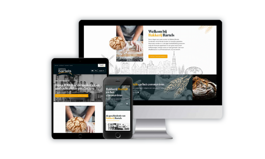
Such an authentic company naturally requires a recognisable and unique corporate identity. And that is precisely why the house style has been restyled, firstly to improve the image and secondly to create more recognisability. Important core values that the company must radiate are authenticity, history, right to exist (100 years) and craftsmanship. A skyline was sketched and designed in which these core values are represented: craftsmanship is depicted by the mill, gristmills and bread. In addition, several recognisable Amsterdam buildings are displayed, highlighting the history and right to exist. You imagine yourself in 1925, when Bartels' bakers took the first step towards a successful business. The historic black-and-white photo emphasises this feeling. In addition, icons have been added to emphasise craftsmanship but also to modernise the design along with authenticity . You can also see these core values reflected in the fonts.
Besides the website, it was also translated into a corporate identity manual, various printed materials and packaging for bread.
Curious about the result?