
In Broekpolder Health Centre, various care providers work together under one roof! What unites us in our work is that we try to improve the lives of our clients/patients in different areas. We focus on physical, personal and social aspects of life and pay much attention to exercise, lifestyle and prevention.
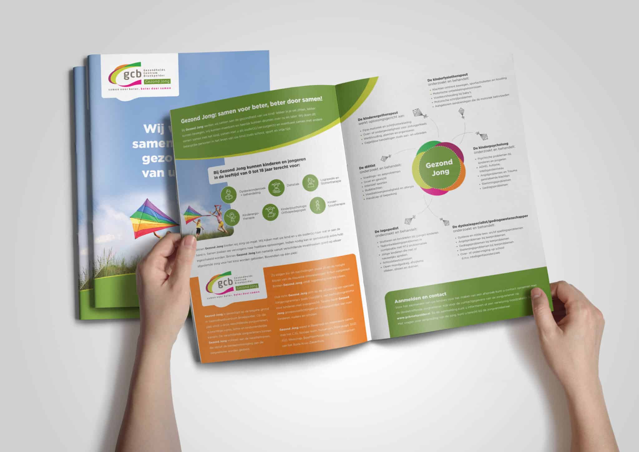
We were asked to create a new A4 leaflet with a front and back for Healthy Young, a partnership for young people. The brochure had to have a fresh, fun and accessible look. The target group was mainly young families/parents/ primary schools/ colleague referrers (general practitioners). The information therefore had to be presented in a creative and pleasantly readable way.
The concept:
An A4-sized folded leaflet was chosen, mainly because of the amount of information so that it is pleasant to read. In addition, the front also has to attract attention first, after which readers become curious and want to read more. Here, a clear and attention-grabbing title was chosen. The various disciplines are represented by kites emerging from the core. In fact, the kite is part of the corporate identity and has been creatively added in abstract form. The core represents the logo in terms of colours and style and it is shaped like a flower. Why a flower? Young people flourish with the Healthy Young partnership. The leaflet has become a beautiful result that informs the target group in a pleasant way!

Design and realisation of printed matter
E-mail: [email protected]
Phone +31 (0) 228 318025
Emergency number in the event of malfunctions:
+31 (0) 6 150 105 30

Impression Enkhuizen
Molenweg 5
1601 SR Enkhuizen (nh)
Impression Menaam
Dyksterburren 33
9036 MR Menaam (frl)

Impression Maastricht
Stationsplein 8K
6221 BT Maastricht (L)
