Learning is moving forward!
Physio Learning
Physio Learning provides training at various locations. All these locations have beautiful rooms where we offer our high-quality courses. They distinguish us through a personal approach with a modern online learning platform, plenty of space for contact, congestion-free course times, good catering and networking opportunities. Moreover, they also offer the possibility of organising fully organised Incompany courses on location for around 20 colleagues.
the purpose
The company, formerly Scholing Randstad West, has grown considerably over the past 10 years, so a name change was necessary. They asked us to help with this and to translate this into a logo and a new corporate identity.
execution and style
The logo represents physiotherapy; the three circles are similar to a spine like a prototype. Also, the image was created from the core value of 'sharing knowledge' where the three circles radiate a cloud of thought. So a double meaning! In addition, the three circles are a reference to the old logo where three circles were also recognisable, respecting the company's history. The brand name is completely new, so a little bit of recognition is still important. The colours represent the three core values: professional (blue), caring (turquoise) and the friendly way of teaching (pink). The colours are a modern shade and together with the modern font, the concept is complete.
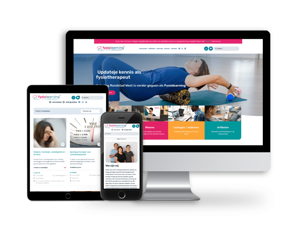
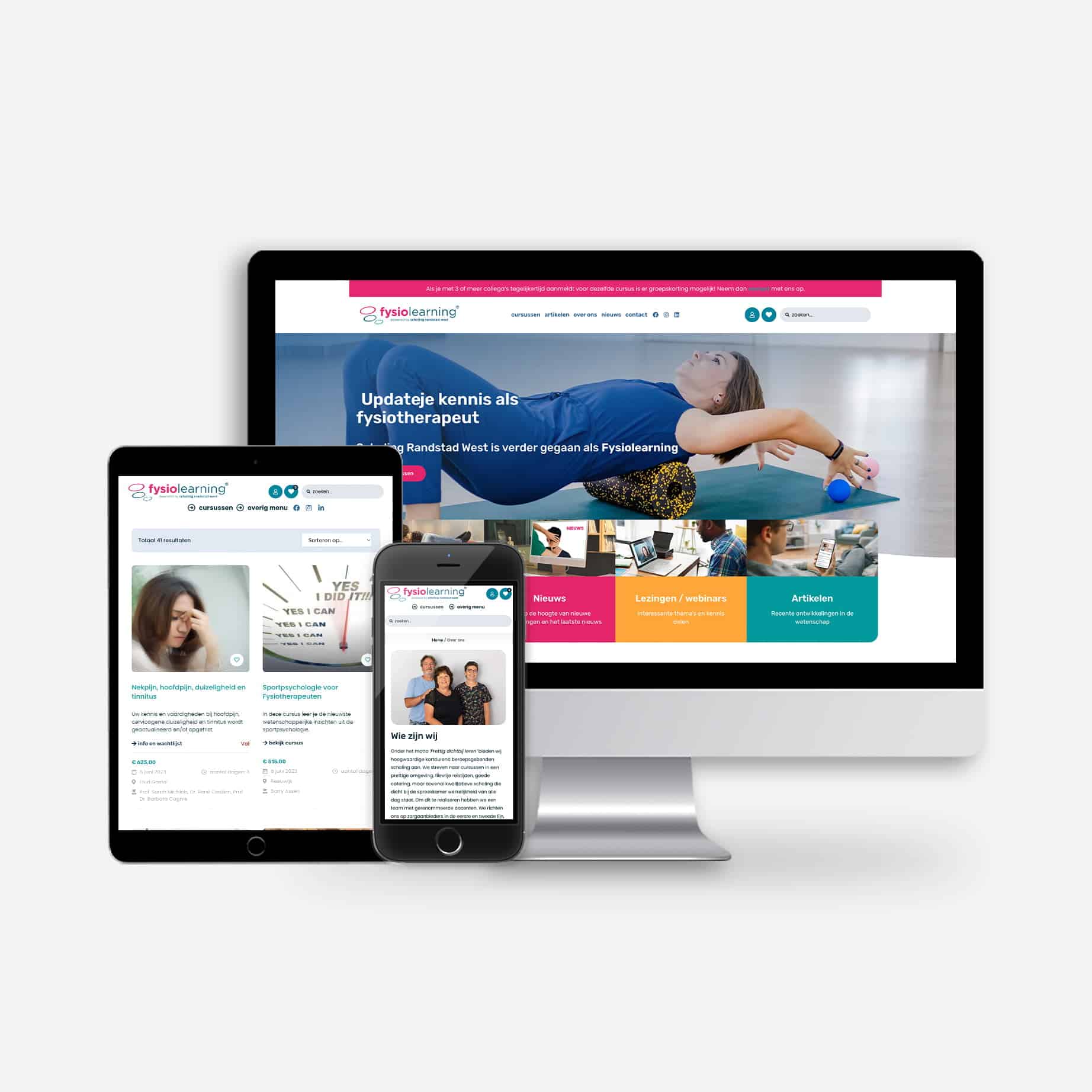
We then developed the website with a fully automated system where people can register from courses, run online courses and (re)view materials in the account.


