Louwerman Elektra
Louwerman elektra services performs all common work regarding; small-scale installation technology, networks, alarm systems, electronics.

execution and style
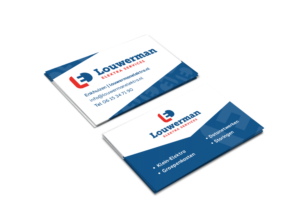
We were asked to design a corporate identity and logo, including a business card. It had to be a logo with a recognisable image and the services also had to be represented. The concept: an 'L' and a plug create an extra symbol through the void between the letters. The 'L' and a plug create an E in the gap. This creates recognisability and people also quickly associate the logo with the L of Louwerman and the E of Elektra services. The logo, on the other hand, is also a single entity and can also be used separately over time once it has created familiarity.